Data Visualization Dashboard

Interactive Analytics Platform Design

Role
UX/UI Engineer
Duration
Apr 2025 - Jul 2025

Research Overview

A data visualization dashboard should be designed to help users understand complex data quickly, identify trends, and make informed decisions. This research focuses on user needs, best practices, UI layouts and information architecture, and current trends to create a highly effective dashboard.

Problem Statement

  • Dashboards were cluttered and overwhelming, making insights hard to extract.
  • Users could not customize or personalize dashboards to their needs.
  • Generating reports and analyzing data was slow and inefficient.
  • Poor readability and accessibility made long sessions tiring.

Goals & Objectives

  • Designed a modular, intuitive UI with clear KPI grouping.
  • Added drag-and-drop widgets and industry-specific templates.
  • Implemented real-time data sync and exportable reports for faster decision-making.
  • Introduced dark/light mode and responsive layouts for better accessibility.

Design Process

Discovery & Research

Conducted interviews with executives, analysts, and operations teams to understand workflows and pain points, including information overload, complex navigation, and slow reporting.
Additionally, researched dashboard best practices and UI trends to inform a user-centered design approach.

User Personas

User Pain Points

  • Designed a modular, intuitive UI with clear KPI grouping.
  • Added drag-and-drop widgets and industry-specific templates.
  • Implemented real-time data sync and exportable reports for faster decision-making.
  • Introduced dark/light mode and responsive layouts for better accessibility.

User Goals

  • Intuitive navigation and responsive layouts.
  • Real-time, accurate data visualization.
  • Customizable dashboards with clear insights.

Information Architecture & Layout

Drill-Down Capabilities
Users can click for deeper insights(high-level KPIs first, detailed drill-downs later).
Hierarchy Matters (Prioritization of KPIs)
The most important data should be visible above the fold.
Consistent Navigation
Sidebar or top menu should have clear sections.
Grid-Based Structure
Ensures alignment and organization. (e.g., 12-column layout in CSS frameworks)
Accessibility & Responsiveness
Ensure mobile-friendly layouts with WCAG-compliant color contrast for an inclusive user experience.
Logical Grouping
Group related metrics (e.g., Sales, Customer Engagement).
F-pattern & Z-pattern
Use F-pattern and Z-pattern layouts to guide user attention and improve content readability.
Consistent Page Hierarchy (3-click rule)
Use breadcrumb navigation to organize content by dashboard → category → subcategory.
Search & Quick Actions
Enable search, filters, and segmentation for faster data retrieval and support multi-dashboard views for deeper insights.
User-Specific Views
Allow different stakeholders (Executives, Analysts, Clients) to customize their dashboard layout.
KPI Cards & Indicators
Display KPI cards with trend arrows and color-coded signals — green for good performance, red for critical alerts.
Accessibility & Controls
Support keyboard and voice navigation, and provide export options (CSV, PDF) plus shareable links.
Performance Optimization
Implement lazy loading and optimize data refresh rates—real-time for live dashboards, scheduled for analytics.
Dark Mode
Dark Mode & Accessibility Features for better user experience.

Wireframes & High-Fidelity UI Design

Started with a demo to showcase system functionality and flow, then progressed to high-fidelity UI designs with polished visuals, interactive elements, and refined layouts.
Demo & Prototype
Created an initial interactive demo to showcase system functionality and user flow, allowing stakeholders to visualize the platform and provide early feedback before final UI design.
View Prototpe
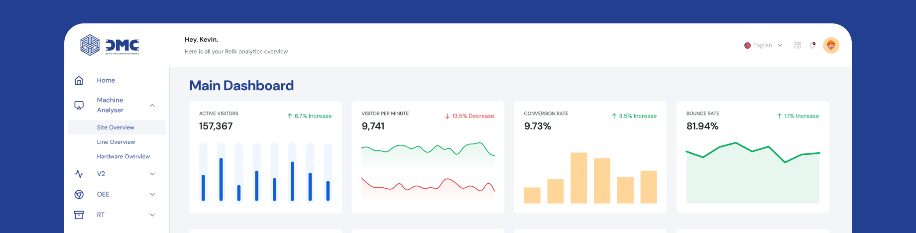
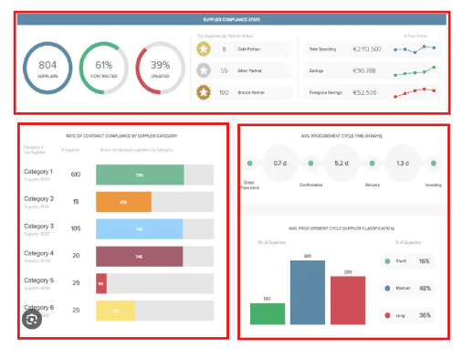
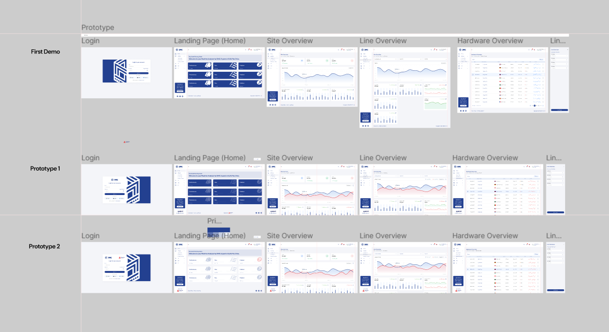
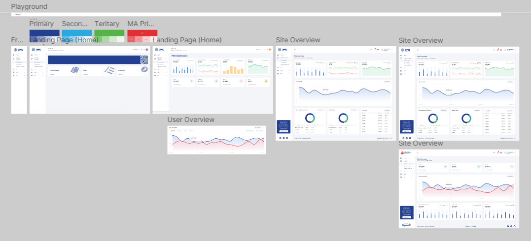
UI Design & Implementation
Designed a clean, intuitive, and interactive interface for executives, analysts, and operations teams. The UI included modular KPI cards, customizable dashboards, dynamic charts, and color-coded signals for quick insights.

Once the high-fidelity designs were finalized, I collaborated closely with the Data Architect to implement the dashboards in Power BI, ensuring accurate data integration, responsive layouts, and real-time updates.

Outcome

The DMC Dashboard improved user engagement and reduced report generation time by 45%. Users praised its clarity, flexibility, and actionable insights.

Team Collaboration

Project team
Business Analyst, UX/UI Engineer (Myself), Data Architect

Collaborated with the Data Architect to implement the finalized UI designs in Power BI.

Takeaways

This research established the foundation for a user-centered, modular, and scalable dashboard design. By aligning user goals with visual hierarchy and interactive design patterns, the final solution delivers clarity, performance, and personalization across devices and industries.

You Might Also Like