MCQMED

Medical Education Platform UX/UI Design

Role
UI Intern (Design + Front-end)
Duration
Oct 2022 to Apr 2023

Project Overview

MCQMED is a digital platform that helps medical students prepare for exams through multiple-choice questions (MCQs), performance analytics, and study resources. The goal was to make exam preparation more engaging, accessible, and data-driven while maintaining a clean, distraction-free interface.
Live Website
Explore the live MCQMED website to see the final implementation.
Visit Website

Problem Statement

Students often found existing study platforms overwhelming with cluttered interfaces, confusing navigation, and limited performance feedback that made learning inefficient and frustrating.

The challenge was to design a modern, structured, and adaptive experience that promotes focus, clarity, and continuous improvement.

Goals & Objectives

The goal of MCQMED is to create a more effective and engaging platform for healthcare professionals and medical students to test and enhance their medical knowledge.

This was accomplished by designing a user-friendly and intuitive interface featuring customizable quizzes, progress tracking, instant feedback, score comparisons, and an analytics dashboard for administrators to monitor engagement and evaluate the effectiveness of educational programs.

Design Process

User research: Summary

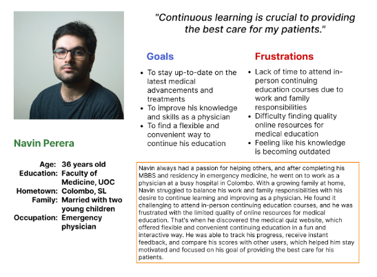
Before designing MCQMED, our team conducted in-depth user research to understand the needs and pain points of healthcare professionals and medical students, who were our primary users. We organized focus group discussions and one-on-one interviews to gather meaningful insights into their study habits and challenges.

We discovered that users wanted not only a simple and efficient way to test their knowledge but also a more engaging and interactive experience that would help them retain information effectively.

Based on these findings, we designed features such as progress tracking, instant feedback, and score comparisons to enhance engagement and motivation. These insights guided the design of a platform tailored specifically to the target audience, resulting in a more effective and rewarding learning experience.

User research: Pain Points

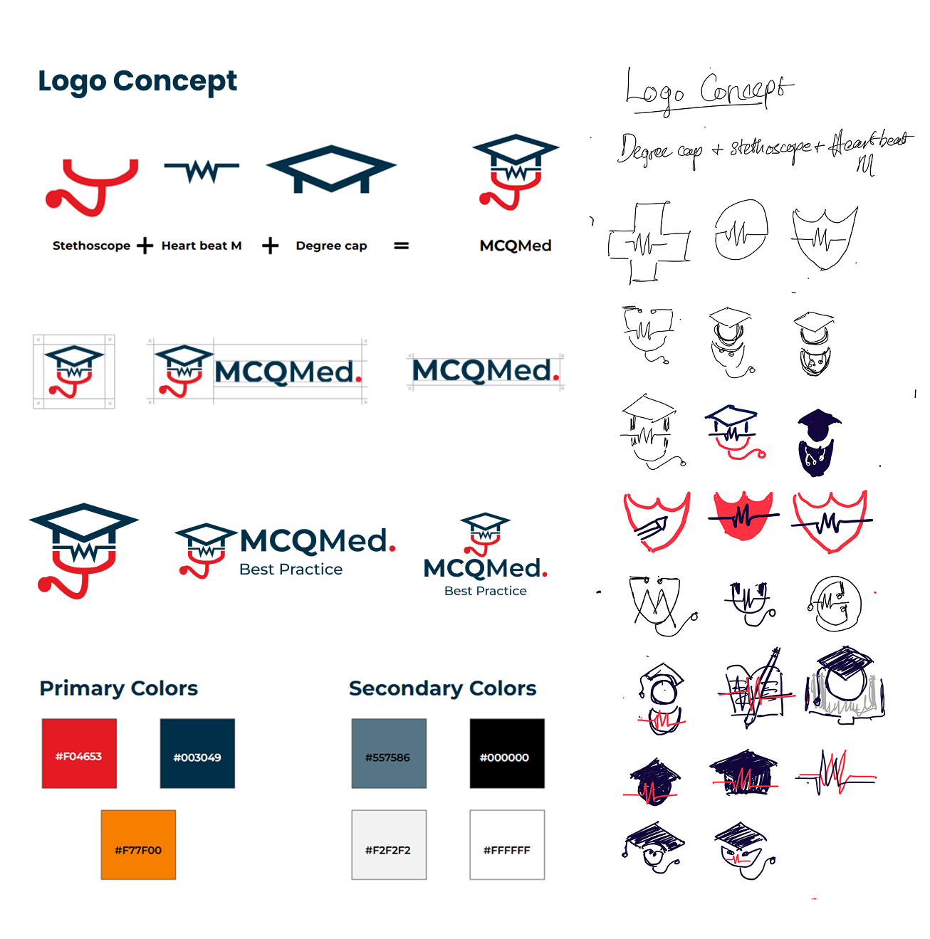
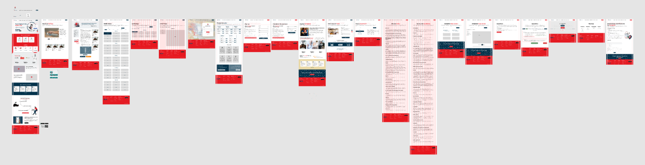
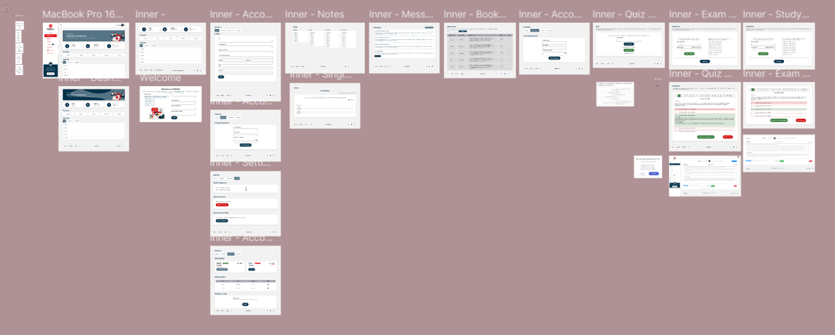
1. Lack of Engagement
The existing MCQMED platform felt unattractive and uninspiring, leading to low participation and poor knowledge retention. To solve this, the redesign introduced progress tracking, instant feedback, and score comparisons to make learning more interactive and motivating.
2. Ineffective Assessment
The platform failed to provide accurate and personalized assessments of users’ knowledge. To address this, customizable quizzes covering various medical topics were implemented, along with instant feedback to help learners understand their strengths and weaknesses.
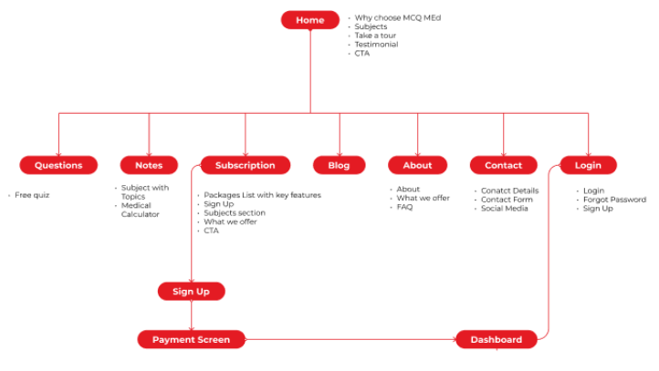
3. Poor User Experience
Users found the interface confusing and difficult to navigate. The redesigned platform focused on clarity and usability by introducing a cleaner layout, logical information flow, and improved accessibility across devices.
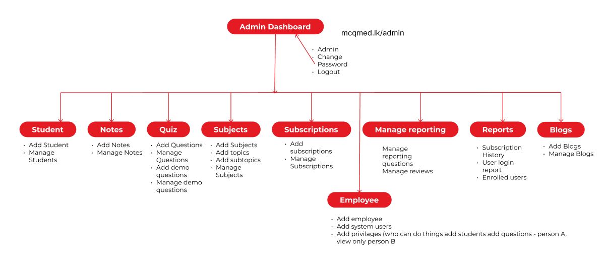
4. Lack of Data and Insights
Administrators lacked visibility into user behavior and performance trends. To overcome this, an analytics dashboard was introduced, enabling administrators to monitor engagement, track usage, and evaluate the effectiveness of educational programs.

User Personas

Problem
Maneesha is a busy medical student, needs a convenient and effective way to study for her exams because traditional methods of studying are time-consuming and don't provide immediate feedback
Problem
Navin is a practicing physician who needs to stay updated with the latest medical advancements because it is essential for providing the best possible care to his patients.

Branding & Visual Identity

The MCQMED logo consists of an icon and a wordmark designed to reflect a modern, minimal, and professional medical brand.
Wordmark Design
MCQ in bold letters, Med in semi-bold letters
The full stop signifies the abbreviation for "Medical"
Logo Concept
The logo integrates elements that communicate medical education and learning:
  • Stethoscope — representing healthcare professionals
  • Heartbeat M — symbolizing life and health
  • Degree Cap — emphasizing learning and knowledge
The overall branding focuses on clarity, professionalism, and approachability, ensuring consistency across the platform, website, and marketing materials.

User Flow

Free Quiz Flow

Website Flow

Student Dashboard

Admin Dashboard

High-Fidelity UI Design

Designed a clean, intuitive, and engaging interface for students and administrators, featuring dashboards, interactive quizzes, instant feedback, and performance analytics.
Website
Designed a modern and professional landing page with clear messaging, feature highlights, and seamless user access.
Student/User Platform
Created an intuitive, engaging interface for quizzes, progress tracking, instant feedback, and personalized learning.
Admin Platform
Developed a streamlined dashboard for managing content, monitoring performance, and generating analytics insights.

Takeaways

Outcome & Impact

The redesign of the MCQMED platform resulted in a more user-friendly and engaging interface, significantly enhancing the study experience for medical students. The new design effectively addressed the pain points of the target users, improving knowledge retention, usability, and overall platform satisfaction.

Reflection & Learnings

This project reinforced the importance of designing with the user in mind. Conducting usability tests, incorporating accessibility considerations, and iterating based on feedback were key to creating an effective and inclusive learning platform. It highlighted how user-centered design and thorough testing contribute to the success of digital products.

You Might Also Like